Work
Canalway
Research, Strategy, & Design // Logo & Brand Identity System
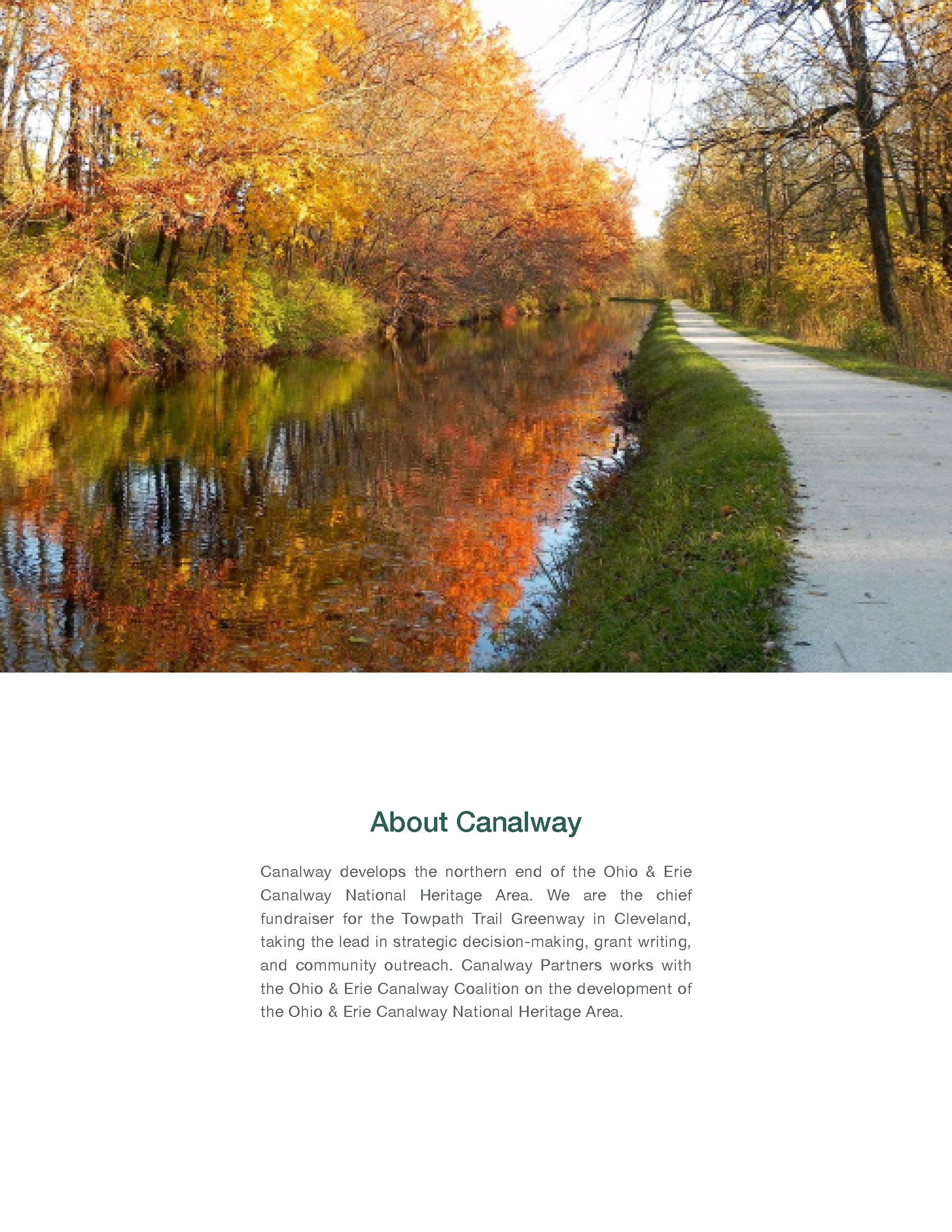
The Client
Canalway is a non-profit cultural heritage organization that serves as a catalyst for projects and programs within the Ohio & Erie Canalway National Heritage Area in Cuyahoga County.
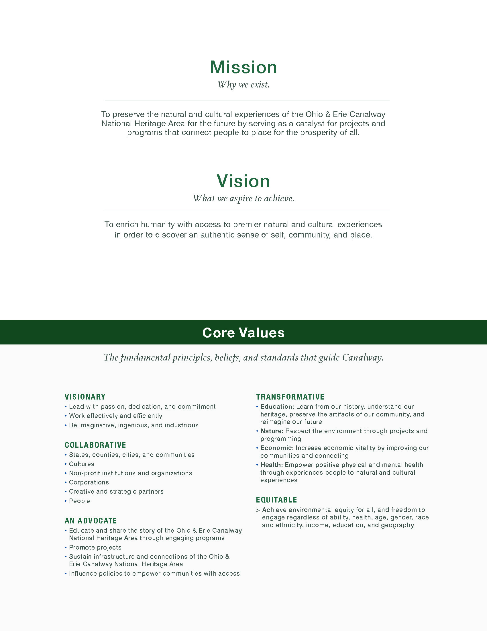
The organization exists to preserve the natural and cultural experiences of the Ohio & Erie Canalway National Heritage Area for the future by serving as a catalyst for projects and programs that connect people to place for the prosperity of all.
The Challenge
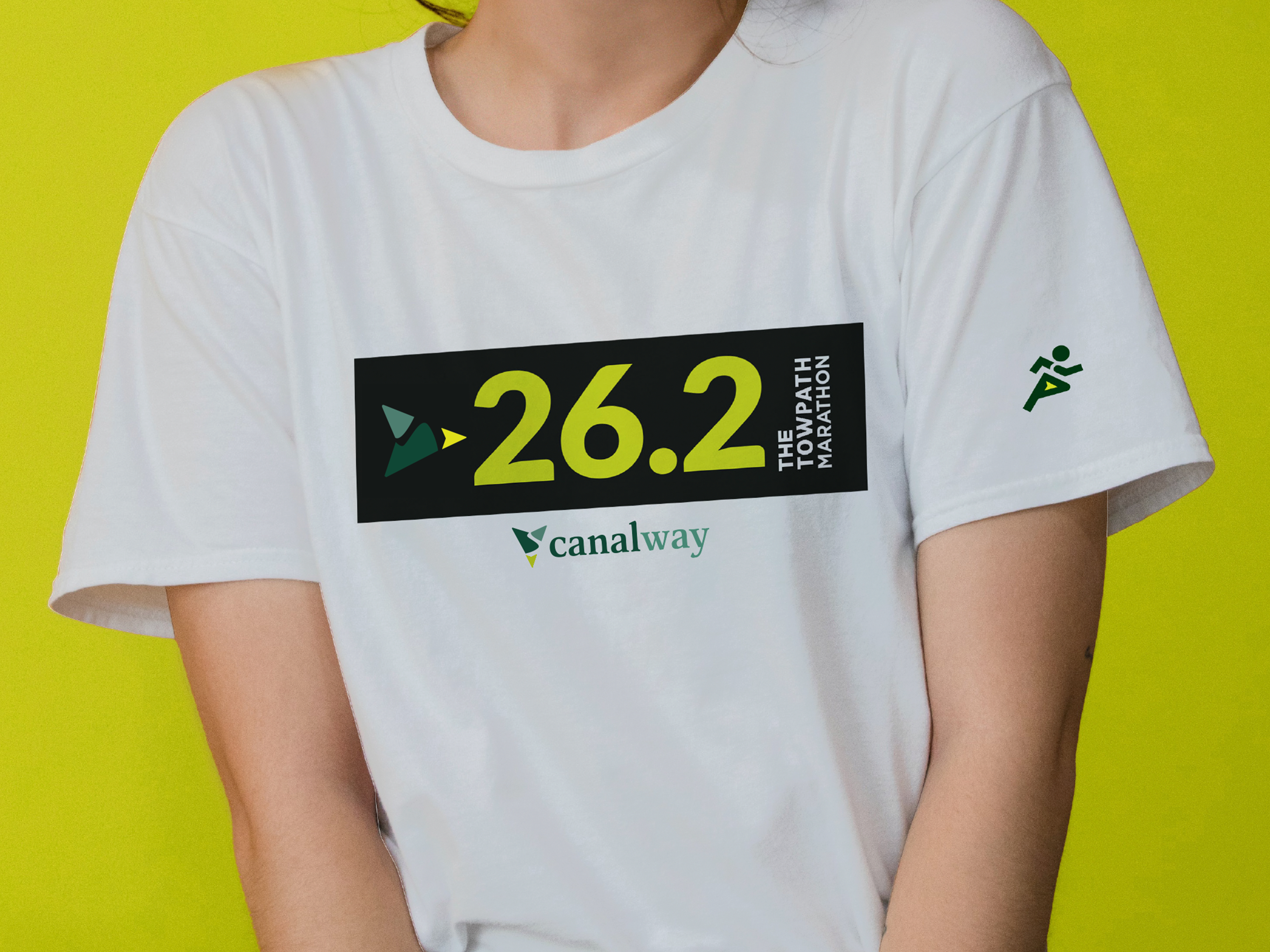
Throughout its 35-year history, Canalway led the development of the Towpath Trail in Cuyahoga County, initiated the development of Canal Basin Park, and programmed acclaimed Cleveland events, including The Towpath Marathon, Cycle Canalway, and RiverSweep.
Near completion of the Towpath Trail in Cuyahoga County, the founder and first executive director retired, requiring the board of directors to search for and select a new executive director to guide the organization into its next chapter with a renewed vision for the future.
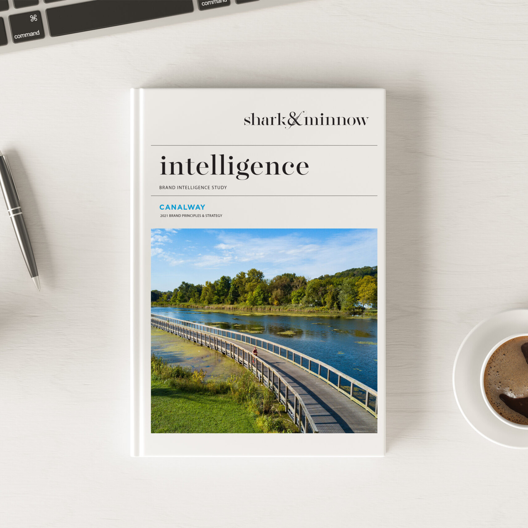
To assist in this transformation, Canalway selected shark&minnow to redefine its mission, vision, core values, and brand identity system.
The Solution
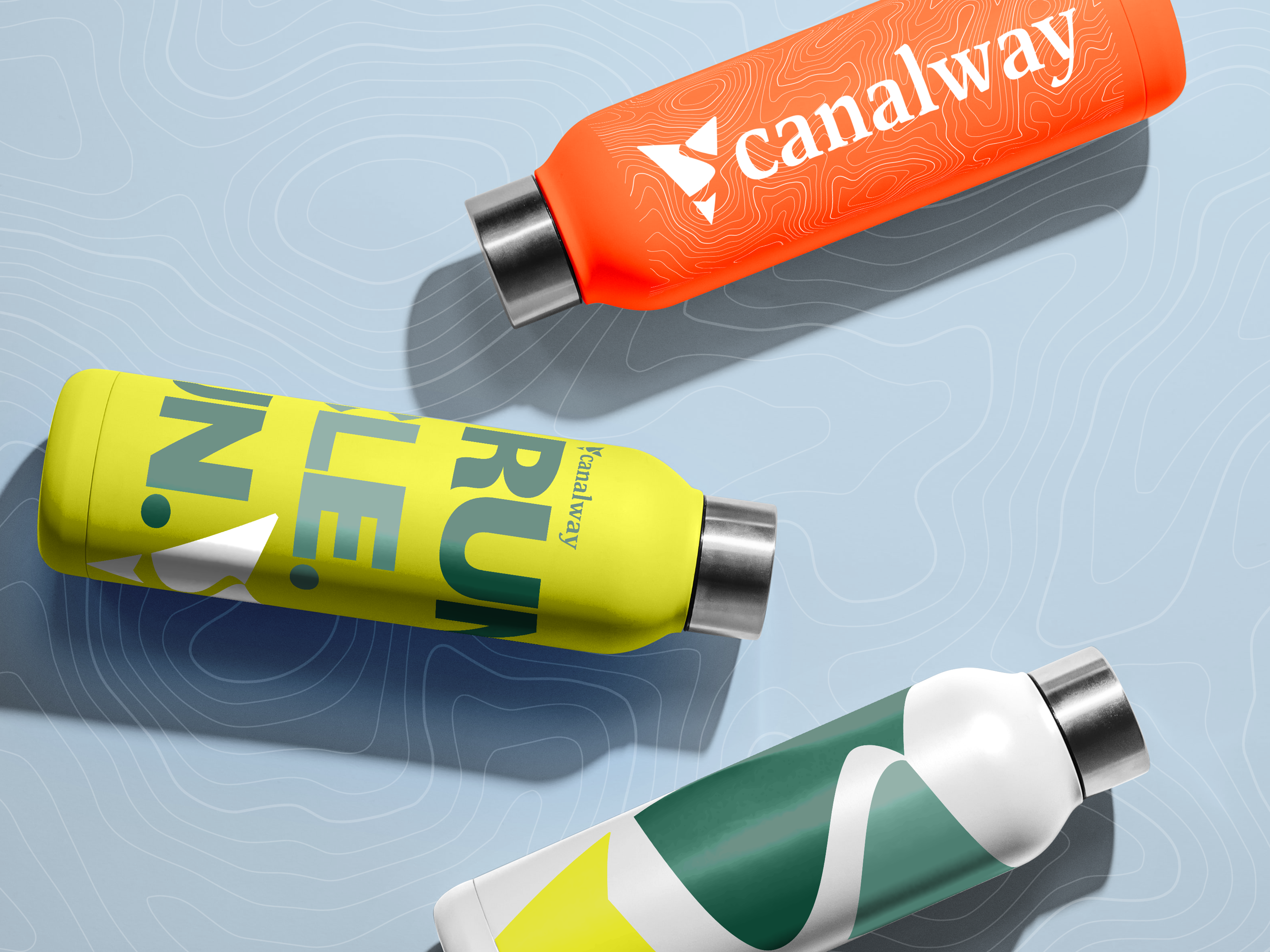
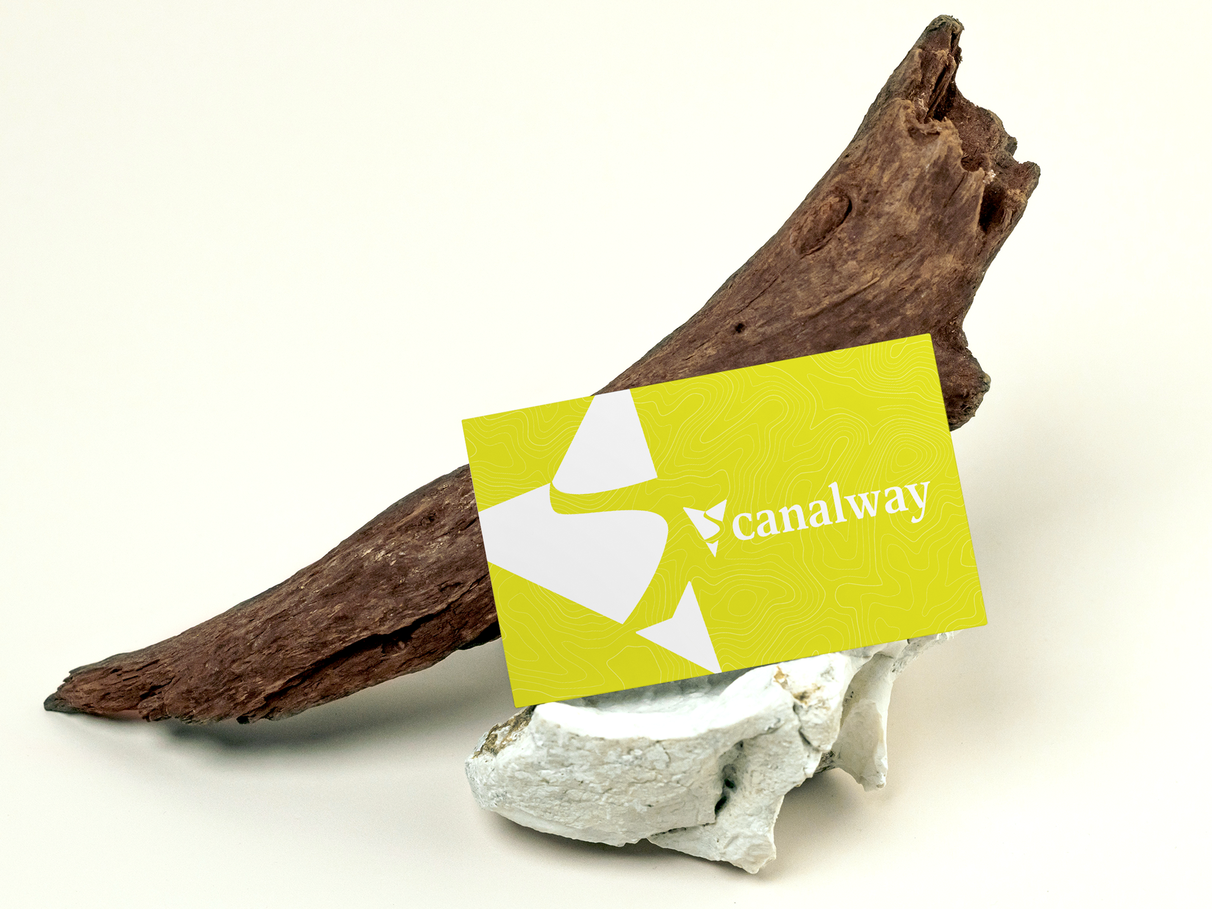
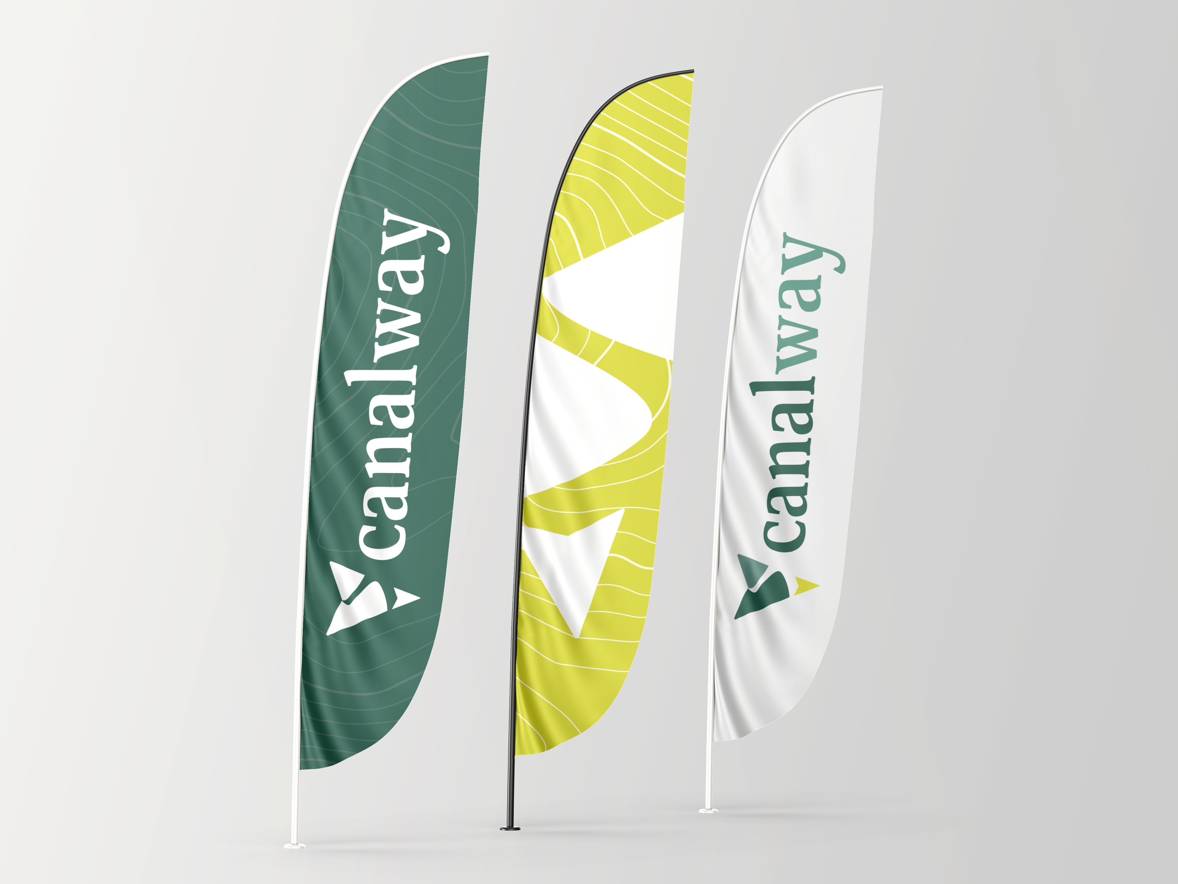
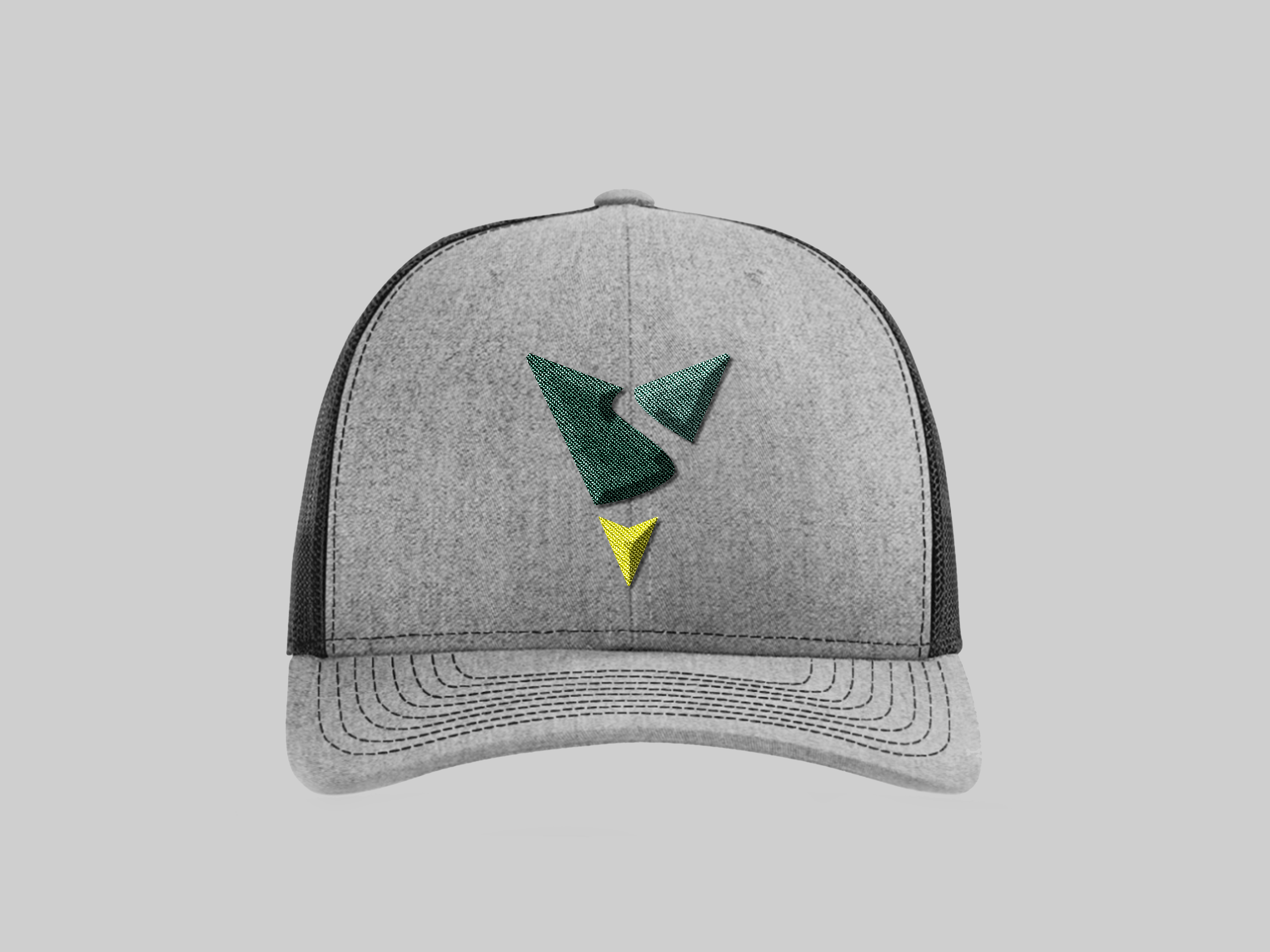
Brand Identity System
Inspired by nature, the towpath, and cultural exploration, the Canalway brand refresh takes on a bold new look that tells the story of the brand. The arrowhead shape, both overall and highlighted at the tip of the mark, acts as a testament to the needle on a compass leading the way for all. Its shape draws a familiar connection to environmental brands such as the National Park Service. The negative space of the mark acts as both the Ohio Canalway and the Cleveland towpath running from North to South. The three-part icon symbolizes the Canalway brand vision to enrich humanity with access to premier natural and cultural experiences to discover an authentic sense of self, community, and place.
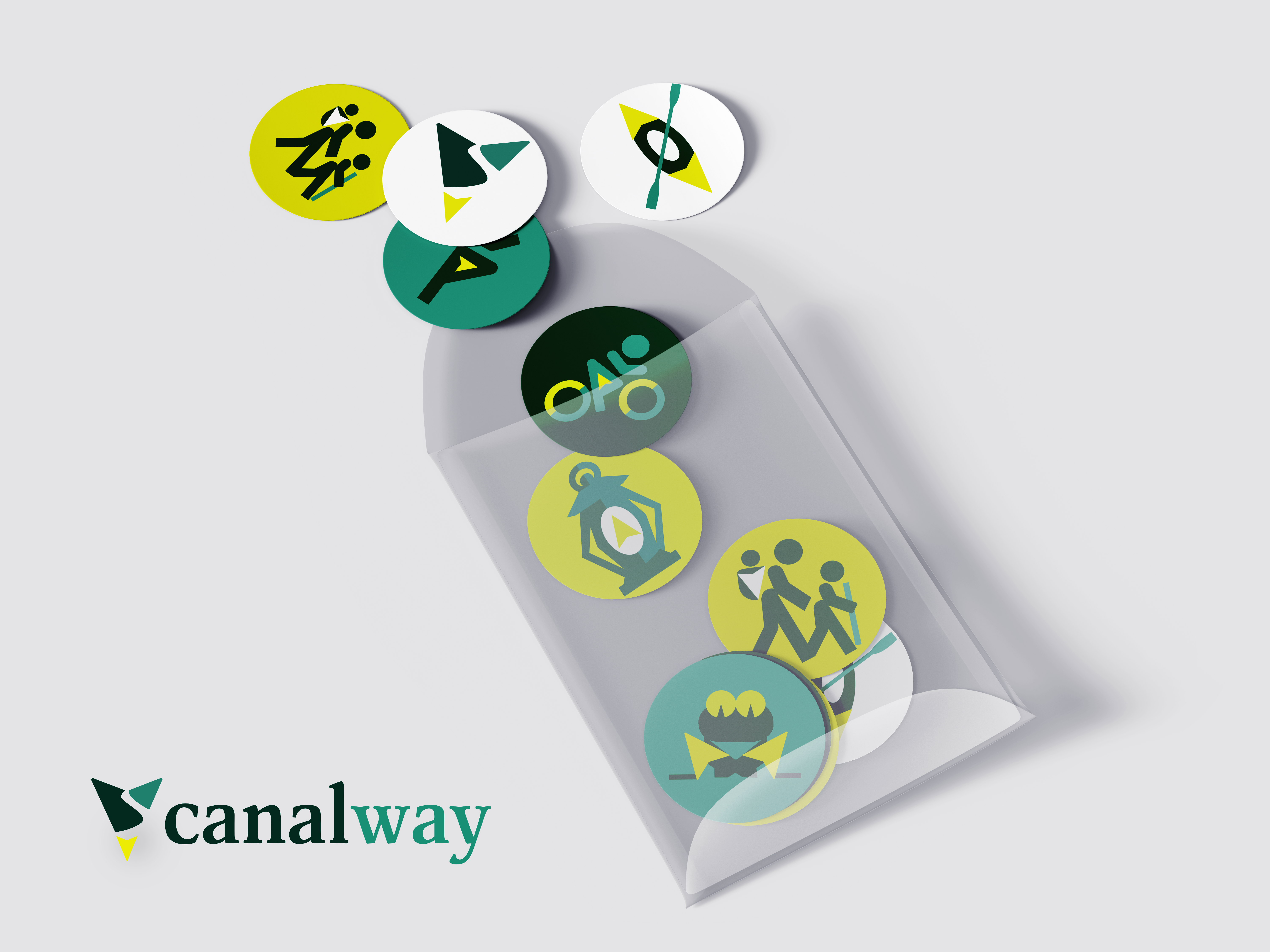
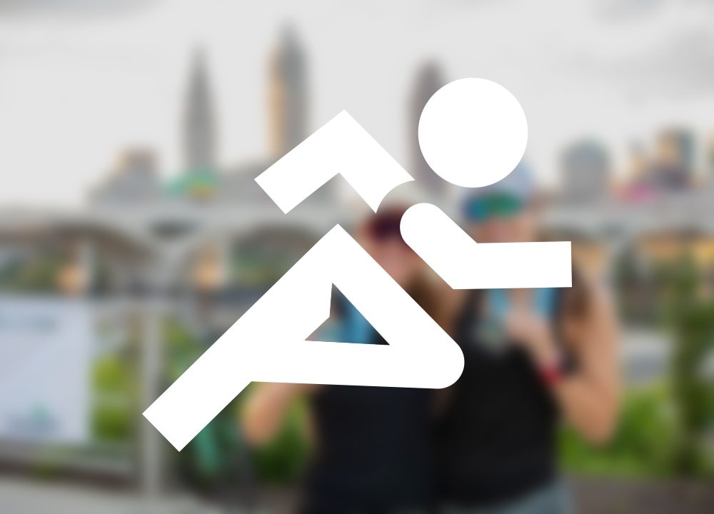
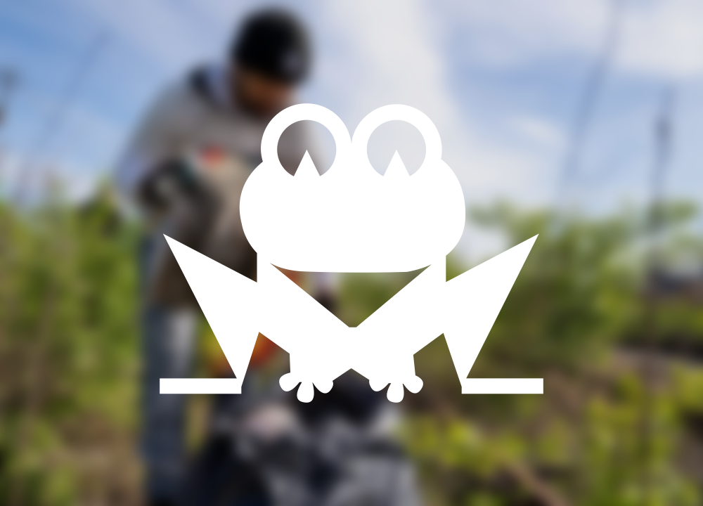
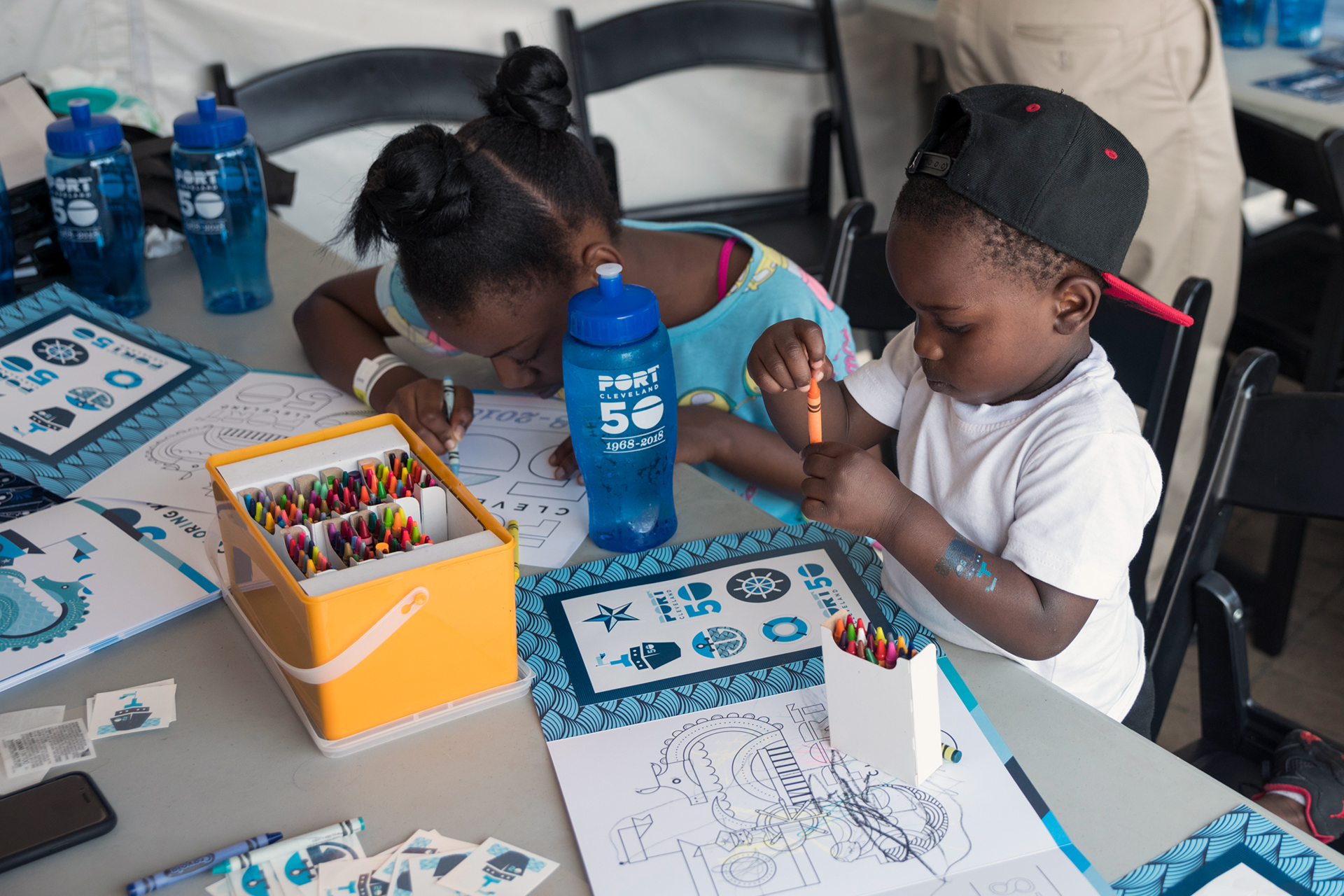
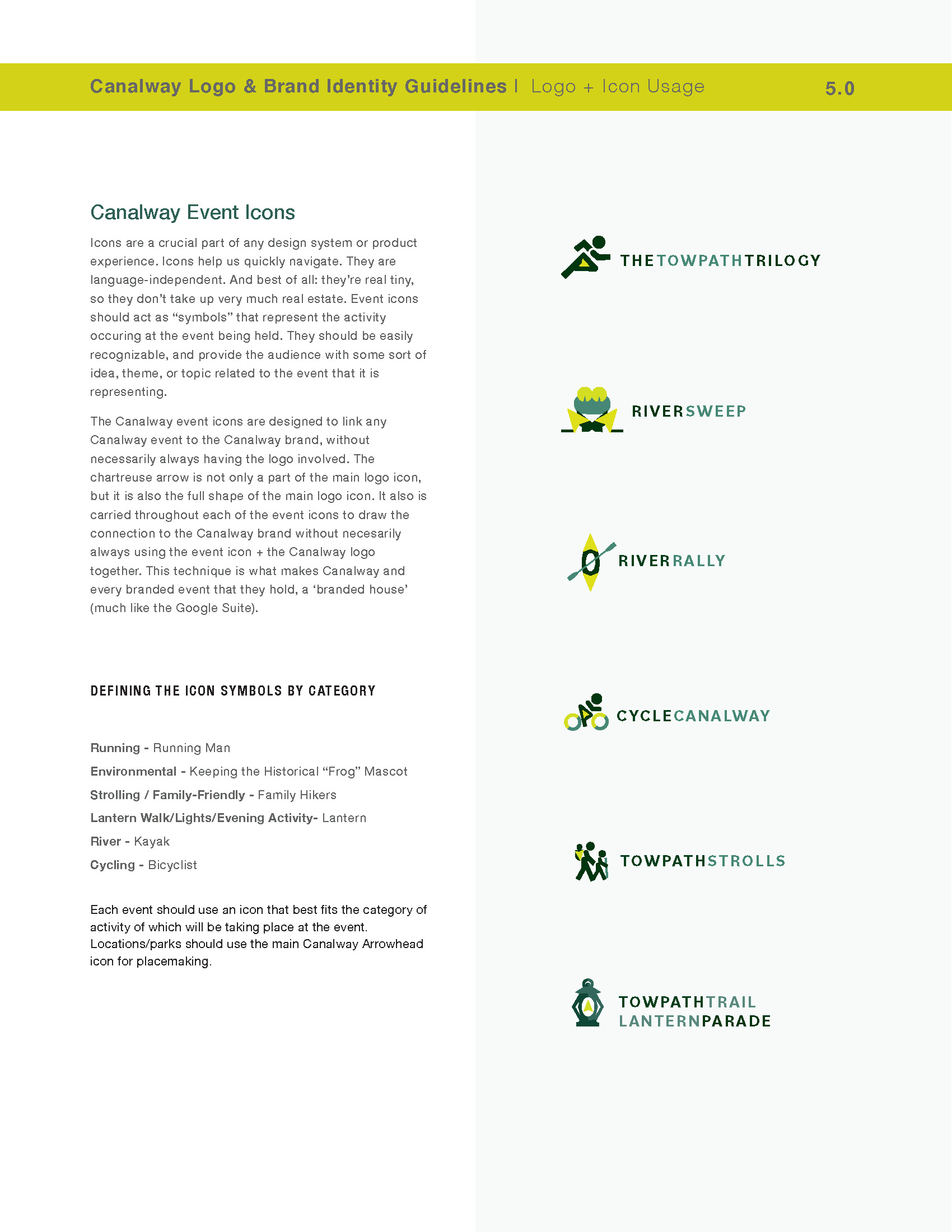
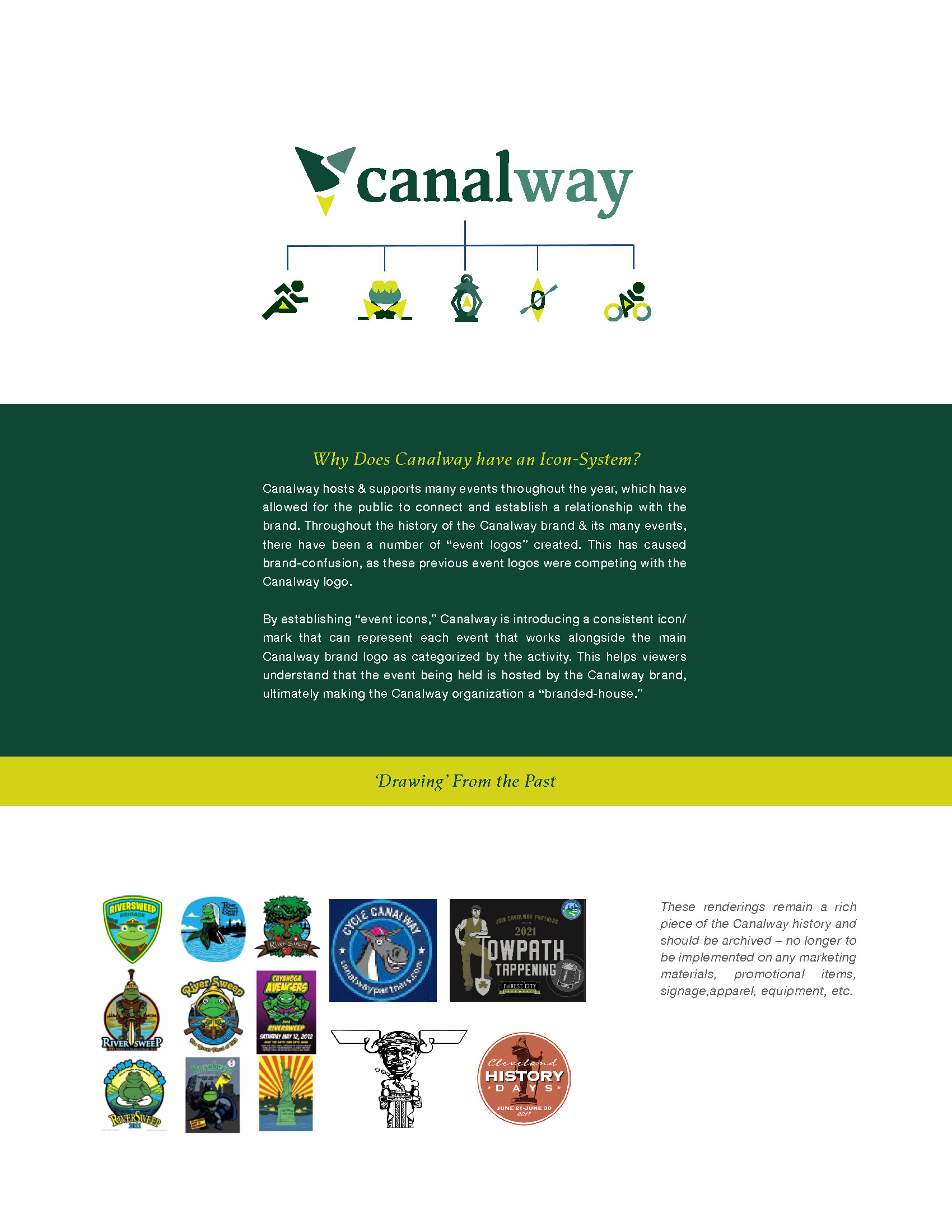
Canalway hosts and supports many events throughout the year, allowing the public to connect and establish a relationship with the brand. Throughout the history of the Canalway brand & its many events, there have been several “event logos” created. This has caused brand confusion, as these previous event logos competed with the Canalway logo.
By establishing “event icons,” Canalway introduces a consistent icon/mark representing each event that works alongside the main Canalway brand logo as categorized by the activity. This helps viewers understand that the event being held is hosted by the Canalway brand, ultimately making the Canalway organization a “branded house.”
Before
After
Before & After Animation
Research & Strategy
To explore the organization’s brand essence and reveal insights to guide the design development of the new brand name and identity system, shark&minnow first conducted a primary and secondary qualitative and quantitative research study, structured in the following phases:
- Company
- Customer
- Competition
- Climate
- Culture
Insights revealed during the study were used to develop the following:
- Brand intelligence report
- Target audience segmentation
- Media ecosystems
- Competitive analysis
- Trend analysis
- New brand name
- Strategic brand principles: Mission, vision, and core values
- Brand logo and identity system
- Design principles and brand guidelines
- Integrated marketing strategic plan
- Content strategy, pillars, and calendar
Brand Guidelines
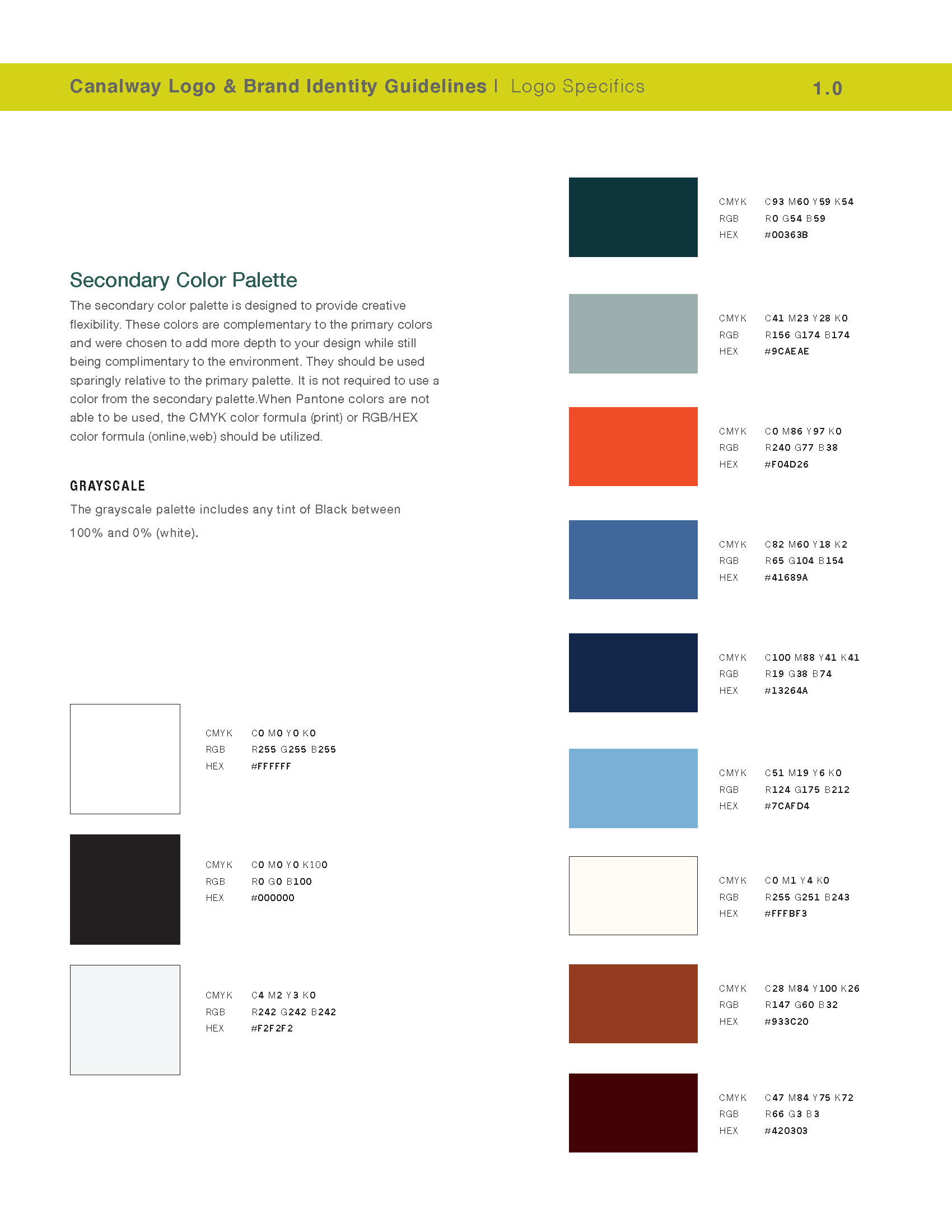
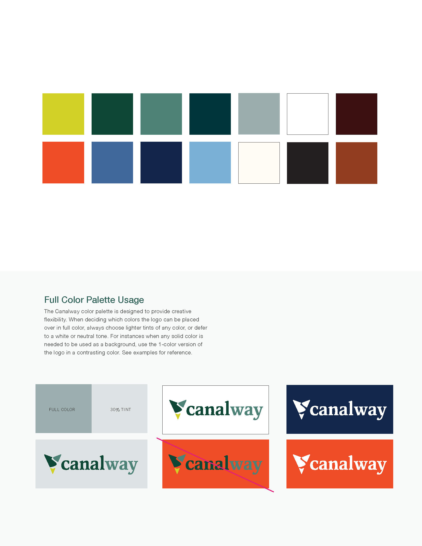
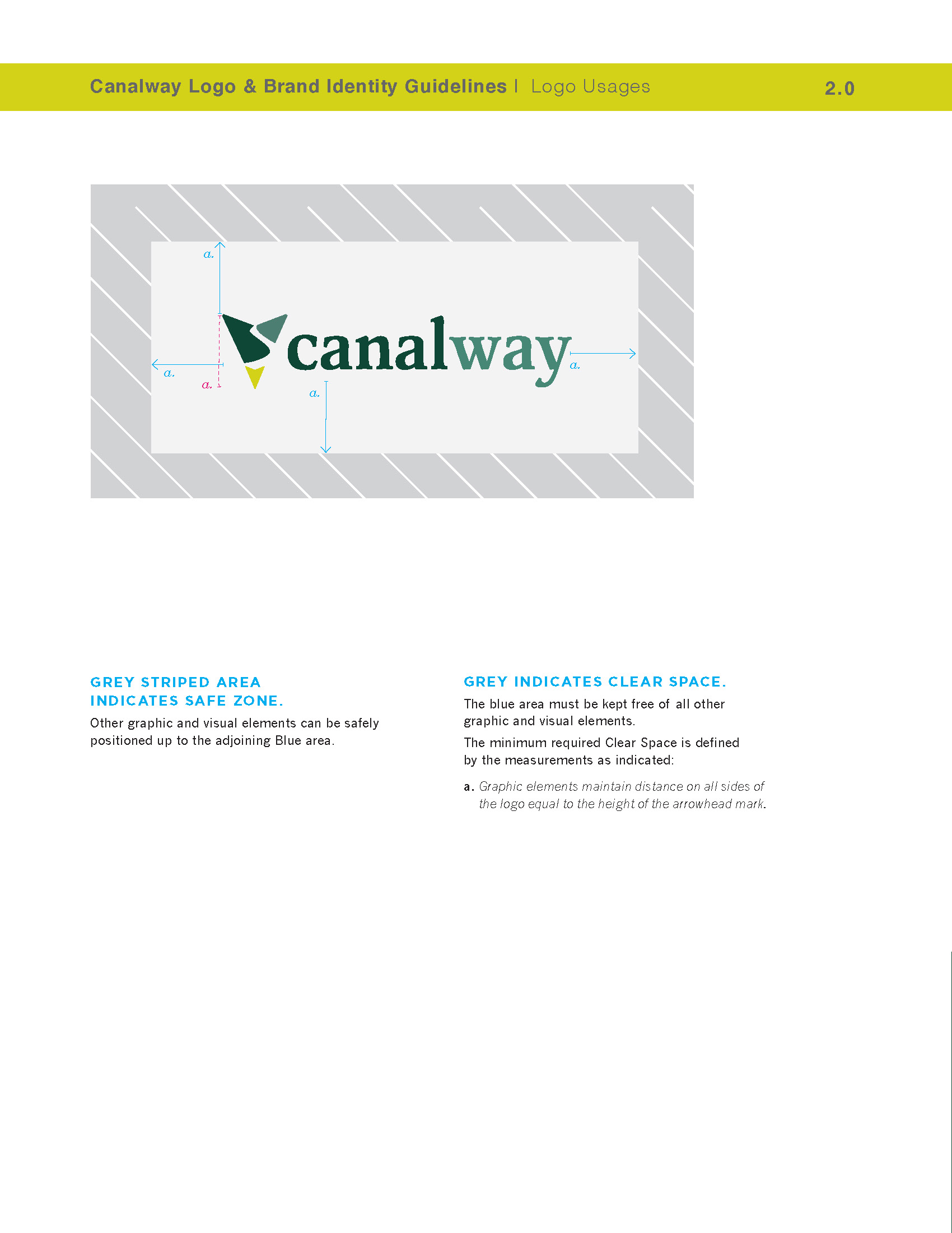

Brand Identity System